About

(Card design for pattern on book)
It all started when…
“The Gist of Bid Whist” was one of my more memorable projects I’ve had the luxury of being apart of. Lamont Jones (author of book) reached out to me in interest of me creating visual assets for Clyde Hill Publishing. He gave me the first couple of chapters that I found intriguing. Particularly the chapter dedicated to the inception of Bid Whist: Pullman Porters
The mission statement for the book was to platform Bid Whist not only in it’s practice, but its history as well. helping further the understanding Bid Whist and it’s cultural significance to Black America.
(For more information click here)
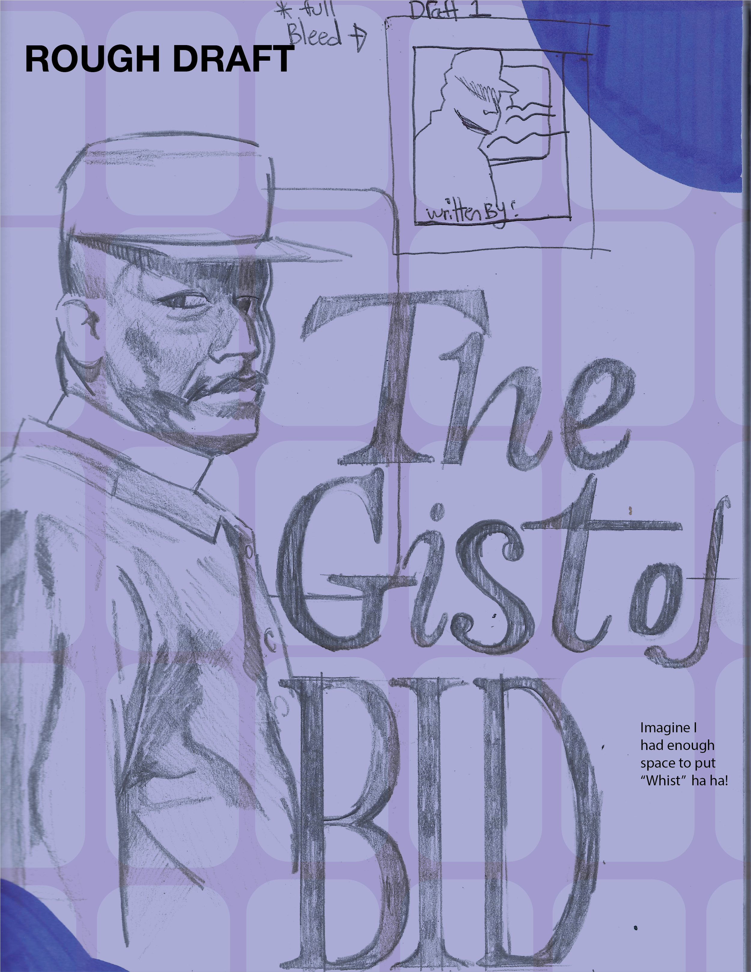
This was the original rough idea I had for the composition, scale, patterning and typography for the book. I was interested in a stylized- curvy fonts to give a sense of elegance to the book.
I was originally interested in making the Pullman Porters the central theme to the game, giving credit to a black underclass once a time ago. Giving these men more acknowledgement for their cultural contributions to the black community.


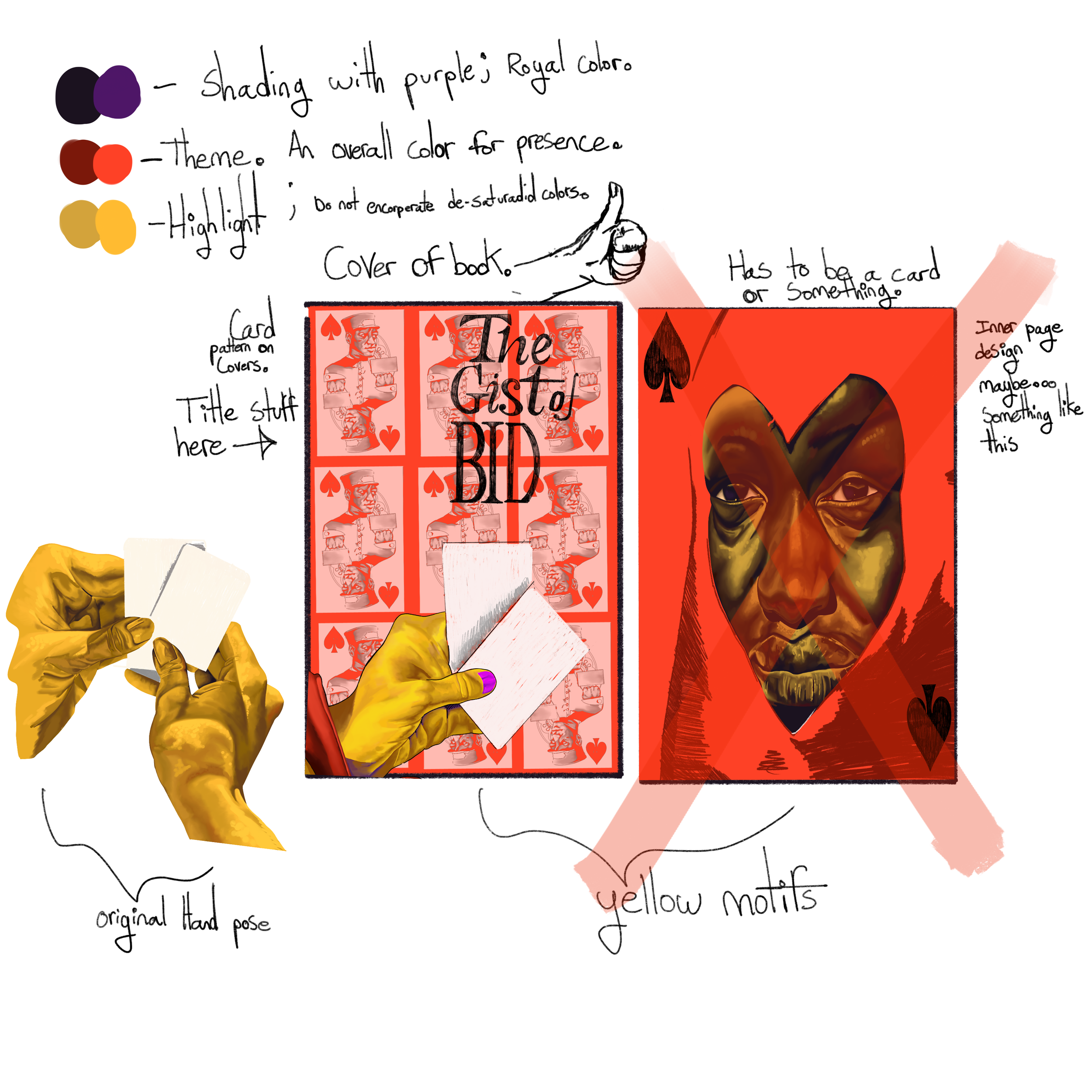
The original idea of having the Pullman Porters be the main central focus of the design was later turned down, however, the company and author was interested in the Pullman Porters being integrated in some way. I decided to use them to be apart of a Card design. Integrating their likeness into a card itself.
I really wanted to push the idea of a woman holding a card in some fashion, but the drafts were all rejected. Below are all the drafts I thought of as well as a link to the second pitch draft I had in mind.


FINAL

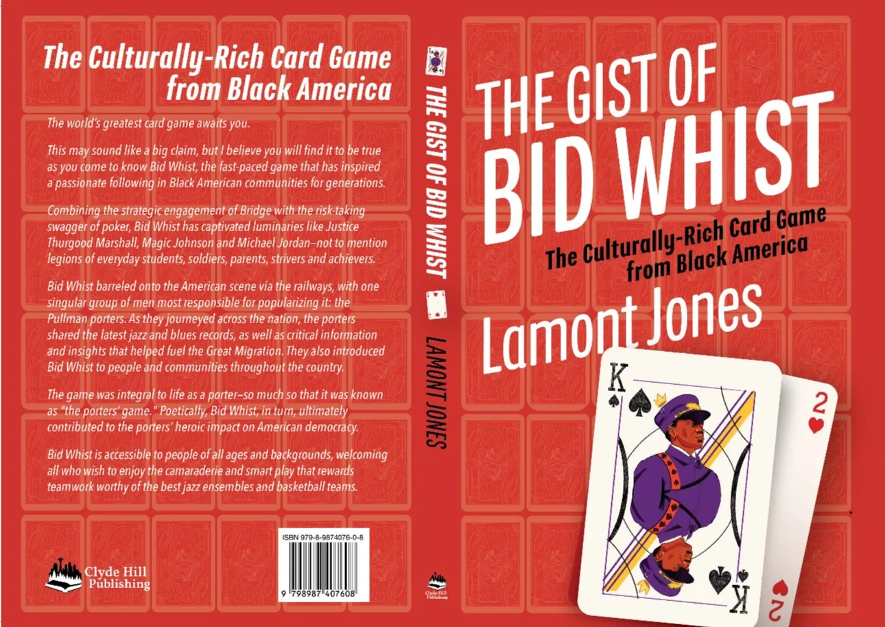
The company decided to keep all but the actual rendered hands shown previously. They were really invested in the card idea and wanted to keep to it.
The response has been all well and postiively receptive for the final product.